Correct the Map: Why Africa’s True Size Matters

Published by Gabriel in 3. Good to know · Saturday 05 Sep 2026 · 5 minutes
On 4 September 2026, the United Nations General Assembly adopted a resolution that may seem, at first glance, to be only about geography.
But it is about much more than geography.
The resolution, titled “Correct the map: rebalancing global cartographic representation and promoting equitable representation of the world’s regions, particularly Africa”, encourages the use of world maps that represent continents in their real relative size.
The vote was overwhelming: 164 countries in favour, 1 against and 6 abstentions.
The only country voting against was the United States.
Estonia, Georgia, Lithuania, Moldova, Serbia and Ukraine abstained.
The resolution is not legally binding. It does not ban the old Mercator projection. But it sends a clear message: the way we draw the world affects the way we understand the world.
Africa did not become bigger. We are only learning to see it correctly.
For centuries, many of us grew up with world maps based on the Mercator projection, created in 1569 for navigation.
For sailors, it was useful. For understanding the real size of continents, it was deeply misleading.
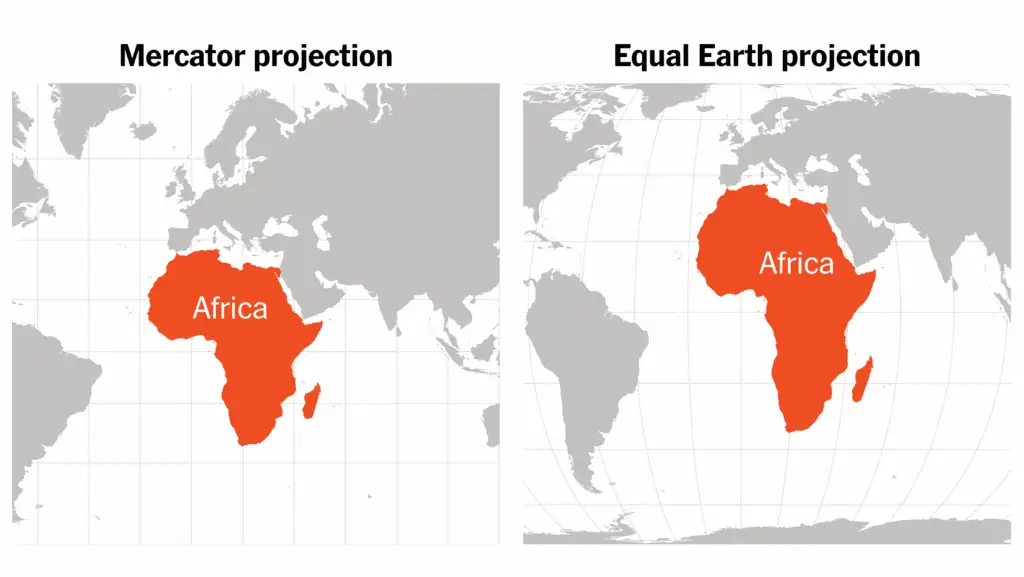
On a Mercator map, areas close to the poles are visually enlarged. Greenland appears enormous. Europe and North America look larger and more dominant. Africa, located largely around the equator, appears much smaller than it really is.
One of the most striking examples is Greenland.
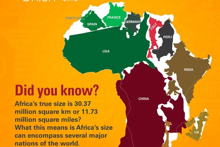
On many traditional maps, Greenland seems almost comparable in size to Africa. In reality, Africa is about 14 times larger than Greenland.
That is not a small visual mistake. It is a distortion that has shaped how generations imagine the world.
Why this matters for Africa
Maps are not neutral objects.
They enter classrooms, books, websites, offices, airports and newsrooms. They influence how children imagine distance, importance and scale. They quietly suggest what is central and what is peripheral.
When Africa is visually reduced, something more than landmass is reduced.
Its presence is reduced.
Its diversity is reduced.
Its weight in the imagination is reduced.
Africa is not a small continent on the edge of the world. It is vast, complex, ancient, young, dynamic and extraordinarily diverse.
It contains deserts, rainforests, savannahs, mountains, great lakes, river systems, cities, cultures, languages and ecosystems of immense richness. Its real scale is not only geographical. It is human, natural and historical.
From Mercator to Equal Earth
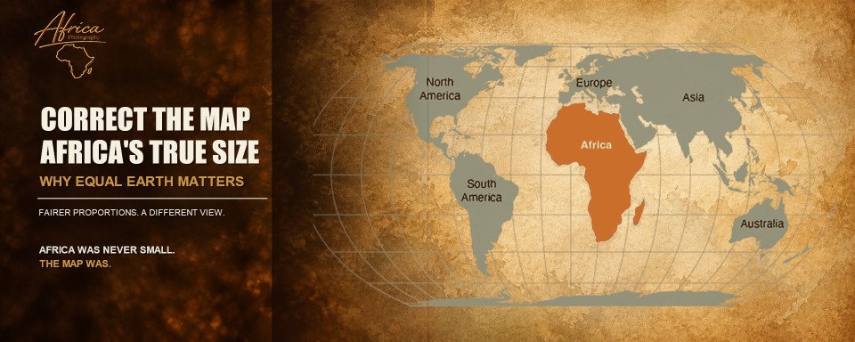
The UN resolution encourages the use of more accurate world map projections, especially equal-area projections such as Equal Earth.
The Equal Earth projection, developed in 2018, preserves the relative size of landmasses much better than Mercator. It still involves some distortion, because every flat map must distort something. But it avoids the most misleading effect of Mercator: the exaggeration of northern regions and the visual shrinking of equatorial continents.
In simple terms:
- Mercator is useful for navigation.- Equal Earth is better for understanding the real size of continents.- Africa appears much closer to its true scale.- Greenland, Europe and North America appear in more realistic proportion.- The world becomes visually less distorted.
Seeing Africa differently
For anyone who travels in Africa, photographs Africa or writes about Africa, this change has emotional meaning.
 When you stand in the Serengeti and watch the plains disappear into the horizon, Africa does not feel small.
When you fly over Tanzania and see rivers, escarpments, forests, drylands and endless savannah below you, Africa does not feel marginal.
When you travel from Tarangire to Ngorongoro, from Ndutu to Serengeti, from Nyerere to Ruaha, or further west to Katavi, you begin to understand scale in a different way.
Not from a classroom wall map.
Not from a distorted projection.
But from experience.
Africa is immense.
And once you have felt that immensity, the old map suddenly looks wrong.
Photography and perception
Photography has something in common with cartography.
Both frame reality.
Both choose what to include and what to leave out.
Both influence perception.
A photograph can make an animal look powerful or vulnerable, close or distant, isolated or part of a wider environment. A map can make a continent appear dominant or secondary.
This is why representation matters.
A good wildlife photograph does not only show an animal. It shows context: light, habitat, behaviour, distance, atmosphere and respect.
In the same way, a good world map should not only show countries. It should help us understand proportion, relationship and reality.
A fairer map is not a detail
Some may see this debate as symbolic. And yes, it is symbolic.
But symbols matter.
They shape habits of thought. They influence education. They affect the stories we tell about places we have never visited.
Correcting the map does not solve Africa’s challenges. It does not change borders, economies or politics. But it corrects something fundamental: the visual language through which the world is introduced to millions of people.
It is a small correction with a large meaning.
Africa was never small.
The map was.
Final thought
For Africa Photography, this moment is a reminder of something simple and important:
To photograph Africa well, we must first learn to see Africa properly.
Not as a reduced shape on an old map.
Not as a distant idea.
Not as a simplified safari postcard.
But as a vast continent, full of scale, complexity, beauty, fragility and presence.
Correcting the map is not only about geography.
It is about respect.